Beige had its moment—but today’s interiors demand more personality and precision. If you’ve ever chosen a paint color that looked perfect on a swatch but completely wrong on your walls, you’re not alone. The challenge isn’t just picking trendy shades; it’s understanding what makes a palette feel balanced, current, and timeless. This guide simplifies modern color palette selection by focusing on the core principles professional designers rely on—contrast, undertone harmony, and proportion. You’ll discover what defines a contemporary palette, explore three ready-to-use combinations, and gain practical tools to confidently create your own without second-guessing every shade.
The Foundation: What Makes a Color Palette “Contemporary”?
First, let’s define the vibe. A contemporary color palette isn’t about specific shades; it’s about a feeling. In most design research, homeowners consistently describe modern interiors as “calm,” “grounded,” and “intentional” (Houzz Trends Report, 2024). In other words, contemporary palettes lean sophisticated and nature-connected rather than loud or purely decorative.
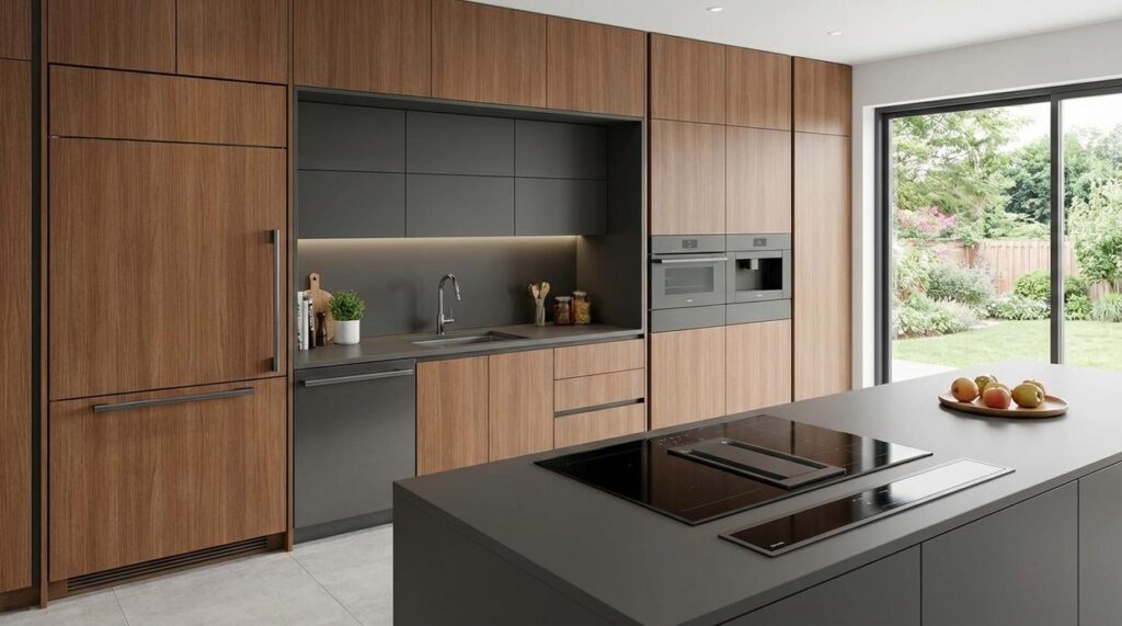
So what are the key characteristics? To begin with, muted, earthy tones—think clay, olive, sand, and warm stone—often anchor the space. Then, deep, moody hues like forest green or charcoal add drama without overwhelming it. Finally, bold accents (a rust chair, a cobalt vase) are used sparingly and precisely. It’s less “paint everything blue” and more “one statement wall that earns its keep.”
Importantly, this marks a shift from past trends. The all-gray-everything 2010s favored cool minimalism, while postmodern design embraced primary colors and high contrast. Today, however, warmth and complexity dominate—like the tonal depth you’d spot in a Denis Villeneuve film set.
Neutrals play a crucial role. Cool grays have largely given way to greige (a gray-beige blend), creamy off-whites, and warm taupes. According to Sherwin-Williams’ 2025 Color Forecast, warmer neutrals now outperform cool grays in residential repaint projects. Ultimately, thoughtful modern color palette selection starts with these inviting foundations.
Applying the 60-30-10 Rule for Perfect Balance
The 60-30-10 rule is a classic interior design principle that divides a room’s color scheme into balanced proportions. Designers rely on it because structured ratios reduce visual chaos and increase perceived harmony. In fact, studies in environmental psychology show that cohesive color distribution improves mood and spatial comfort (Journal of Environmental Psychology, 2014).
Here’s how it works:
- 60% Dominant Color: This foundational shade covers walls, large rugs, or statement sofas. It sets the emotional tone and anchors the space.
- 30% Secondary Color: Next, a supporting hue appears in furniture, curtains, or accent walls, creating contrast without overpowering.
- 10% Accent Color: Finally, bold pops arrive through pillows, art, or décor—small touches that energize the room (yes, this is your “go big” moment).
For instance, consider this modern palette selection: 60% soft white, 30% rich caramel leather, and 10% deep forest green. The white keeps the room airy, caramel adds warmth and texture, and green introduces depth.
Some critics argue rigid formulas stifle creativity. However, constraints often spark smarter experimentation. Much like a well-tailored suit, structure enhances expression rather than limiting it. When applied thoughtfully, this timeless ratio delivers reliable, research-backed balance.
Three Proven Palettes for Instant Sophistication

Palette 1 – The Grounded Naturalist
Terracotta, olive green, cream, and charcoal black form a biophilic palette—a design approach rooted in biophilia, the idea that humans thrive when connected to nature. Research from the Journal of Environmental Psychology shows that natural tones and materials can reduce stress and improve mood in interior spaces. That’s not just theory; hospitality brands like Aman Resorts use earthy hues to create restorative environments guests willingly pay premium rates for.
Terracotta warms up walls or textiles, olive green anchors upholstery, cream softens transitions, and charcoal adds contrast (think of it as eyeliner for your room). Some critics argue earth tones feel dated. But when applied through modern color palette selection—clean lines, matte finishes, minimal clutter—they read elevated, not rustic. The key is restraint: let one shade dominate and allow the others to support.
Palette 2 – The Moody Monochromatic
A monochromatic scheme uses varied shades of a single hue. Deep navy, slate blue, and pale sky blue create sophistication through cohesion. Skeptics say a single-color room risks looking flat. That only happens when texture is ignored.
Layer velvet cushions, linen drapery, and natural wood accents to create visual depth. Designers frequently rely on this technique; according to Houzz trend reports, layered texture consistently ranks among the top methods for adding dimension without clutter. (It’s the difference between a flat playlist and surround sound.) Keep lighting warm to prevent the blues from feeling cold.
Palette 3 – The Optimistic Minimalist
Warm white or light mushroom gray sets an airy base, energized by mustard yellow, dusty rose, or sage green. This palette aligns perfectly with minimalist living room ideas for a clean aesthetic (https://ththomable.com/minimalist-living-room-ideas-for-a-clean-aesthetic/), balancing clarity with personality.
Some argue minimalism feels sterile. Data from Zillow, however, shows homes staged in light neutrals with strategic color accents often sell faster and at higher prices. The proof is practical: brightness attracts, accents intrigue. Keep bold colors contained to art, pillows, or a single chair for impact without overwhelm.
Great ideas are easy. Execution is where rooms win or lose.
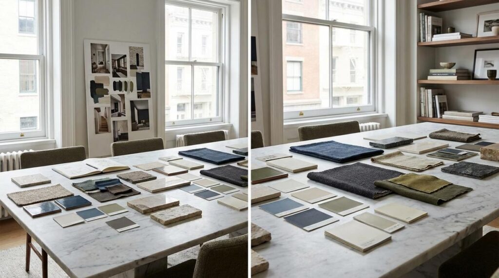
Digital tools vs. physical samples is the first choice. Online palette generators like Adobe Color or Coolors help you experiment fast, compare hex codes, and refine a modern color palette selection before spending a dollar. Convenient? Absolutely. Complete? Not quite.
Physical swatches, fabric samples, and material chips tell a story. Screens lie (ever ordered “warm white” that looked blue?). Texture and finish matter.
Finally, test colors on your walls. Morning sun versus lamps can shift a shade dramatically. Pro tip: paint sample squares and live with them for days.
Your Blueprint for Confident Color Choices
You came here looking for a clear, reliable way to choose colors without second-guessing every decision. Now you have a proven framework to guide you. By applying principles like the 60-30-10 rule and starting with trusted palettes, you remove the fear of making a costly, permanent mistake. This structured approach to modern color palette selection eliminates guesswork and replaces it with balance, cohesion, and confidence.
If you’re tired of staring at paint swatches unsure of what will actually work, take the next step today. Define the mood you want, select a proven palette, and start sampling. With the right plan, your perfect space is closer than you think—begin now and transform your home with confidence.
 Evelyna Fleshericard serves as a lead editorial voice at Ththomable, where her keen eye for aesthetic balance and functional elegance shapes the platform’s décor and style initiatives. With an extensive background in contemporary interior design, she specializes in translating abstract "modern inspiration" into actionable layouts for the everyday homeowner. Evelyna’s contributions are centered on the philosophy that a home should be a curated reflection of one's personality, and she consistently provides readers with the high-end design principles and specialty insights needed to achieve a premium, sophisticated living environment.